Thursday, November 4, 2010

WEEK 13: A3 INTERACTIVE/PRINTED PDF (SAME PDF FACILITATES BOTH)


Printed PDF: http://www.mediafire.com/?v0uvh65a79lbczt


References 
a) STATE. EXPLORING SUSTAINABLE DESIGN. RESPOND. Exhibition at the Object Gallery. http://www.object.com.au/files/file/5229_StateRespondEdKit_lowres.pdf
b) Digital Architecture Now: A Global Survey of Emerging Talent by Neil Spiller 
c) Article: THE NEW SUSTAINABILITY: What goes Around in October 2010 issue of Wallpaper magazine

WEEK 13: LAYAR


http://pipes.yahoo.com/pipes/pipe.run?_id=02527c155f8291ab72c407434cb86fb0&_render=rss

http://tinyurl.com/28umn5r

http://goo.gl/599uf

WEEK 13: QR CODES

Due to the enormous size of my augmented reality model (roughly 445.33 meters wide) I have had difficulty scaling it to a reasonable size which still communicates the message of the sheer scale of the structure as well as allowing for a functional Layar model to be utilised. After experimenting quite heavily I have determined that QR CODE FIVE provides the most suitable vantage point to understand the scale of the structure. Since scale plays such an important role in my re-visioning of the Vitra I see it absolutely necessary to communicate the gigantic proportions of this building. To communicate this scale I have determined that QR CODE FIVE is close enough to require the viewed to move the iphone around to take in the full extent of the building while also allowing for an understanding of the structure to be developed.


QR CODE ONE - SAME AS MODEL (-33.918372, 151.227947)


layar://georssgateway?SEARCHBOX=http://tinyurl.com/28umn5r&SEARCHBOX_2=-33.918372&SEARCHBOX_3=151.227947


QR CODE TWO - SMALL DISTANCE AWAY (-33.918270, 151.228106)

layar://georssgateway?SEARCHBOX=http://tinyurl.com/28umn5r&SEARCHBOX_2=-33.918270&SEARCHBOX_3=151.228106


QR CODE THREE - LARGER DISTANCE AWAY (-33.918762, 151.228314)

layar://georssgateway?SEARCHBOX=http://tinyurl.com/28umn5r&SEARCHBOX_2=-33.918762&SEARCHBOX_3=151.228314


QR CODE FOUR - GREAT DISTANCE AWAY (-33.918969, 151.229838)


layar://georssgateway?SEARCHBOX=http://tinyurl.com/28umn5r&SEARCHBOX_2=-33.918969&SEARCHBOX_3=151.229838


QR CODE FIVE - SLIGHTLY CLOSER THAN A GREAT DISTANCE AWAY (-33.918617, 151.228706)

layar://georssgateway?SEARCHBOX=http://tinyurl.com/28umn5r&SEARCHBOX_2=-33.918617&SEARCHBOX_3=151.228706

Resources

Monday, October 25, 2010

WEEK 12: DRAFT TEXT FOR POSTER


Removed Form

Challenging the form of the Vitra.

The construction industry is estimated to produce 30% of the world’s pollution, more than any other single industry. Demand for sustainability in the sector is growing as concerns for the wellbeing of the natural environment increases. Suggestions have been made that sustainability should become a fundamental consideration for all designers but what does this actually mean for architects? How will considerations of sustainability impact on the design of buildings? Will sustainable architecture result in neutral designs which simply exist to fulfil their purpose and do not make any statements of any kind? Or does a middle ground exist where notions of sustainability can be intertwined with innovative design? These are all questions which have lead to this re-visioning of the Vitra Design Museum. The museum represents excellence in design & it is for this reason it has been re-visioned to question the role of design when it comes to sustainability. The architecture of the museum is widely acclaimed as being of great architectural importance and presents the perfect subject to question architectural sustainability. As the Vitra Design Museum is a post-modernist deconstructivism building it is strongly associated with ideas of fragmentation, non-rectilinear forms, manipulated ideas of internal structure versus external structure, and a sense of controlled chaos. This style of architecture is quite wasteful & excessive when considering sustainability and the amount of energy required to produce it. In the re-visioning of the museum this notion has been used to increase the sustainability of the building by transforming it into a simpler structure. This transformation occurs through the progressive expansion of the original form as various elements of it expand & morph to eventually become one simple structure. The whole process of transformation is documented through number of layers (six specifically) constructed of both solid & negative spaces which will allow for the progressive contrast of changing structure to be observed. The transformation originates from the original structure of the museum which is rendered as negative space in the re-visioning.

Ironically the process used to document the physical simplification of the form adds additional unnecessary structure to the building. This is an intended contradiction that is meant to further emphasise the notion of excessive structure and the size of the impact this has on the environment. With the progressively changing form, & the combination of both void & solid space, ideas of reducing the structural excess are suggested in each simplified layer of the transformation. Although simplifying the form is not implied as the answer to the issue of how to increasing sustainability but instead serves as a metaphor for the measures that architects need to take to incorporate sustainability into their designs. What is being discussed is the notion that having sustainability as a fundamental consideration will most likely change how architecture is designed. But a middle ground needs to be found so architecture does not just satisfy sustainability requirements but also has content in its design. This is directly associated with the two ended symbolism in the re-visioning. The transformation starts & finishes with a simple block/rectangular structure, providing a context for a beginning & an end of the transformation, allowing for the existence of a middle ground.  The beginning block also serves to symbolise the unavoidable origin of structure in its most basic representation. The form of the original Vitra would have been derived from a series of standard primitives which construct the world around us. The presence of beginning block in the negative space of the original Vitra is meant to allow for observers to contrast the origin of the buildings form and understand that it is something that was created by choice & not necessity.  


References 
a) STATE. EXPLORING SUSTAINABLE DESIGN. RESPOND. Exhibition at the Object Gallery. http://www.object.com.au/files/file/5229_StateRespondEdKit_lowres.pdf
b) Digital Architecture Now: A Global Survey of Emerging Talent by Neil Spiller 
c) Article: THE NEW SUSTAINABILITY: What goes Around in October 2010 issue of Wallpaper magazine

TRANSFORMATION OF FORM


Wireframe Renderings


b


Sunday, October 10, 2010

WEEK 12

WEEK 11: IDEA MONTAGE

Using your 150 word descriptive ideas for your direction for your building as a basis, and your 10 image texture pallet, create an A3 expressive montage of your ideas. This should capture the feel and flavour of your thoughts. Post a high quality jpeg of your montage to your blog.

Saturday, October 9, 2010

SIMPLIFYING THE VITRA DESIGN MUSEUM AND AVOIDING BOOLEAN PROBLEMS

I quickly learned that the 3ds Max proboolean operation cannot compute a lot of geometry at the same time. It has no trouble computing multiple simple shapes like rectangular prisms but begins to struggle when you start adding other non-standard primitive geometry. After trying to import the initial high geometry model of the Vitra I began to see the strange results that occur when complex boolean operations are executed. My first resolution to this was to model a much simpler version of the Vitra that excluded all internal geometry from the model and import the whole model into 3ds. However this did not resolve the issue as the geometry of the Vitra as a whole model was still too complex for the boolean operation to execute with intended results.

My next attempt to result this issue was to breakup the geometry of the Vitra into distinct separate models that were NOT unified in any way straight in Max to avoid any import issues. I used the previous Vitra simplified model of the Vitra as a guide.

Friday, October 8, 2010

WEEK 11: DRAFT DESIGN FOR THREE A1 POSTERS


ABOVE - Draft Poster Design One A

ABOVE - Draft Poster Design One B

ABOVE - Draft Poster Design Two

WEEK 11: TEN TEXTURES

For my re-visioning of the Vitra Design Museum I am considering form/structure & transformation/simplification of these. The re-visioning draws on concerns of sustainability & efficiency. I have used these concerns to influence material choice. While the layered transformation of the form/structure of the Vitra is heavily commenting on possibility of efficiency in buildings; the materiality will more directly comment on the sustainable usage of materials through the contrast and comparison of traditional and new construction materials. I have chosen to use concrete to be a dominant material in the re-visioning as it isn't considered the most environmentally friendly material but is so important to modern construction techniques that it cannot be merely ignored. The usage of concrete is intended to foster questioning in the observer about the impact of excessive usage of this material purely for aesthetics sake and whether more environmentally friendly alternatives can be utilised. The choice of a bright orange plastic for the negative imprints is meant to be symbolic is two respects: 1) Symbolising the new age materials which take advantage of new technologies. 2) Be representative of the changing form/structure of the building and the energy that is being consumed in the process, like hot magma occurring from shifting tectonic plates.


Concrete Floor
Concrete Aged

Architectural Concrete

Plain Concrete

Rough Concrete

Orange Plastic

e

WEEK 10: RE-VISIONING THE VITRA DESIGN MUSEUM (CONCEPT DEVELOPMENT)

The Vitra Design Museum is post-modernist deconstructionism. Deconstructivism is associated with ideas of fragmentation, non-rectilinear forms, manipulated ideas of internal structure versus external structure, and a sense of simulated unpredictability & controlled chaos. My intent is to question the form of the Vitra Design Museum and the associated ideas of manipulated structure through progressive contrast. The complex form/structure of the Museum will transform into a simple block structure. This transformation will occur through the progressive expansion of the original building as various elements of it expand & morph to eventually become one structure. 


As the structure expands it will progressively transform into a simple cube.


The process will be documented through number of layers (six specifically) composed of both solid & negative spaces which will allow for the progressive contrast of changing structure to be analysed in augmented reality. Ironically the process I have chosen to document the simplification of the structure adds further structural excess to the building; an intended contradiction that will further emphasise the questioning of  form & structure.  By questioning the essence of the Vitra Design Museum I hope to challenge both designers & architects alike to consider the role they play in reducing excess & unnecessary design elements. I'd like the observer to be challenged and ask-

  • Where do idea of efficiency & effectiveness sit in the design process?
  • How valuable is aesthetic when compared with notions of efficient structure? 
  • Can aesthetic value & efficiency be merged into one?
  • How does the notion of sustainable construction/design incorporate into all this?


WEEK 11: MORE ON THE WALT DISNEY CONCERT HALL (ARCHITECTURAL CASE STUDY CONTINUED)

Hand drawn sketch


Physical Model

Computer Analysis of panels


Axonometric


Axonometric


Axonometric


Section

Section


Plan

Construction Detail


--

WEEK 10: ANOTHER FRANK GEHRY BUILDING (ARCHITECTURAL CASE STUDY)

Walt Disney Concert Hall


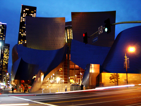
Frank Gehry was selected to design the Walt Disney Concert Hall in 1988 and completed the design of the building three years later in 1991. The building has been praised for both its unique architectural form & impressive acoustics when compared to the Hall’s predecessor, hr Dorothy Chandler Pavilion. Construction of the concert hall began in 1999 and was completed in early 2003. It was officially opened on the 23rd October, 2003 and is estimated to have cost $274 million to construct. Much of this money ($100 million) was donated by the Disney family as a tribute to Walt Disney’s devotion to the arts and to the city of Los Angeles, given presence to the Hall’s name. The structure of the building is intend to be separated into smaller segments as to allow it to "speak a different [architectural] language" than the surround architectures. The shapes of the Hall have been derived from sailing and the forms created by sails in the wind. The exterior of the structure is covered in stainless steel panels which due to excessive reflection problems have had to be sanded in some areas. The building is considered to be a Post-Modernist style known as Deconstructivism which is associated with ideas of fragmentation, non-rectilinear forms, manipulated ideas of internal structure versus external structure, and a sense of simulated unpredictability & controlled chaos.